Since 2001 openDemocracy has been challenging the global status quo and encouraging democratic debate around the world as a highly trusted, independent source of investigative journalism. It's not surprising then that the site attracts over 8 million visits a year, and in 18 years has accrued tens of thousands of articles from hundreds of contributors.
We worked with openDemocracy to migrate, reimagine, redefine, and rebuild from the ground up this massive publishing platform. The design and build of both the public facing site, and the back office content management and editing functionality were approached using lean methodology - starting with the smallest thing and scaling as we tested and learned.
Aside from the major news outlets, there are very few organisations who own and maintain this quantity of journalistic content online. A project of this nature would usually take years to execute; from inception to go live, and would typically involve a large in-house development team. We worked with openDemocracy to deliver this MVP of their new site in under nine months.
The site sits on the open source Wagtail CMS; now used by the NHS, Google, NASA, MIT, and the Peace Corps. We're currently unaware of anyone else using Wagtail like this for a project of this scale, certainly not as performant as this.
We migrated the work of tens of editors, hundreds of authors, thousands of articles, and the experience of millions of readers to a brand new and highly stable platform with a five nines uptime (99.999%). Again, another almost unheard of, and essential given opendemocracy is so heavily donor funded.
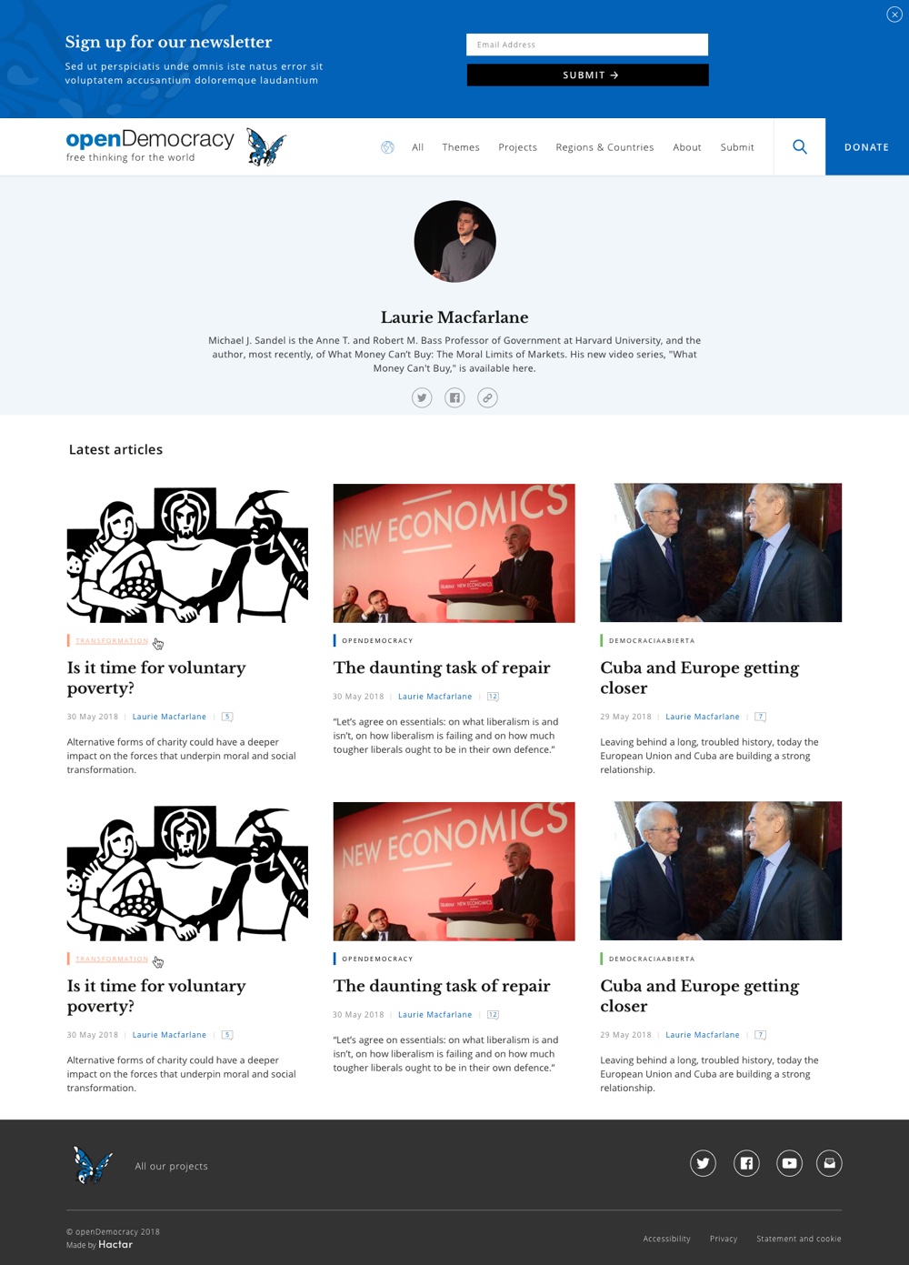
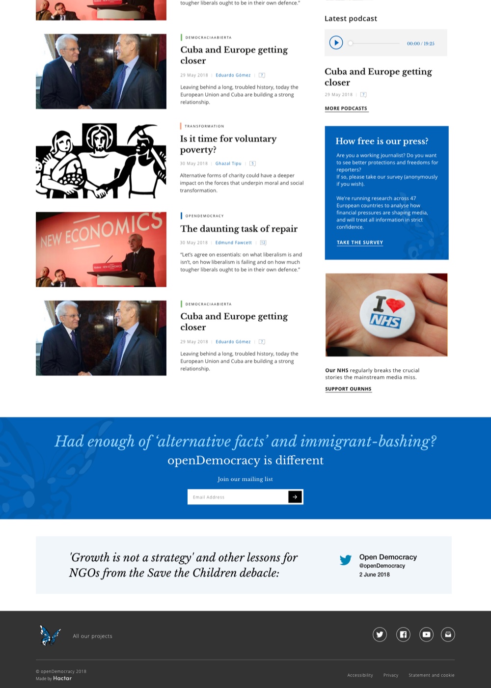
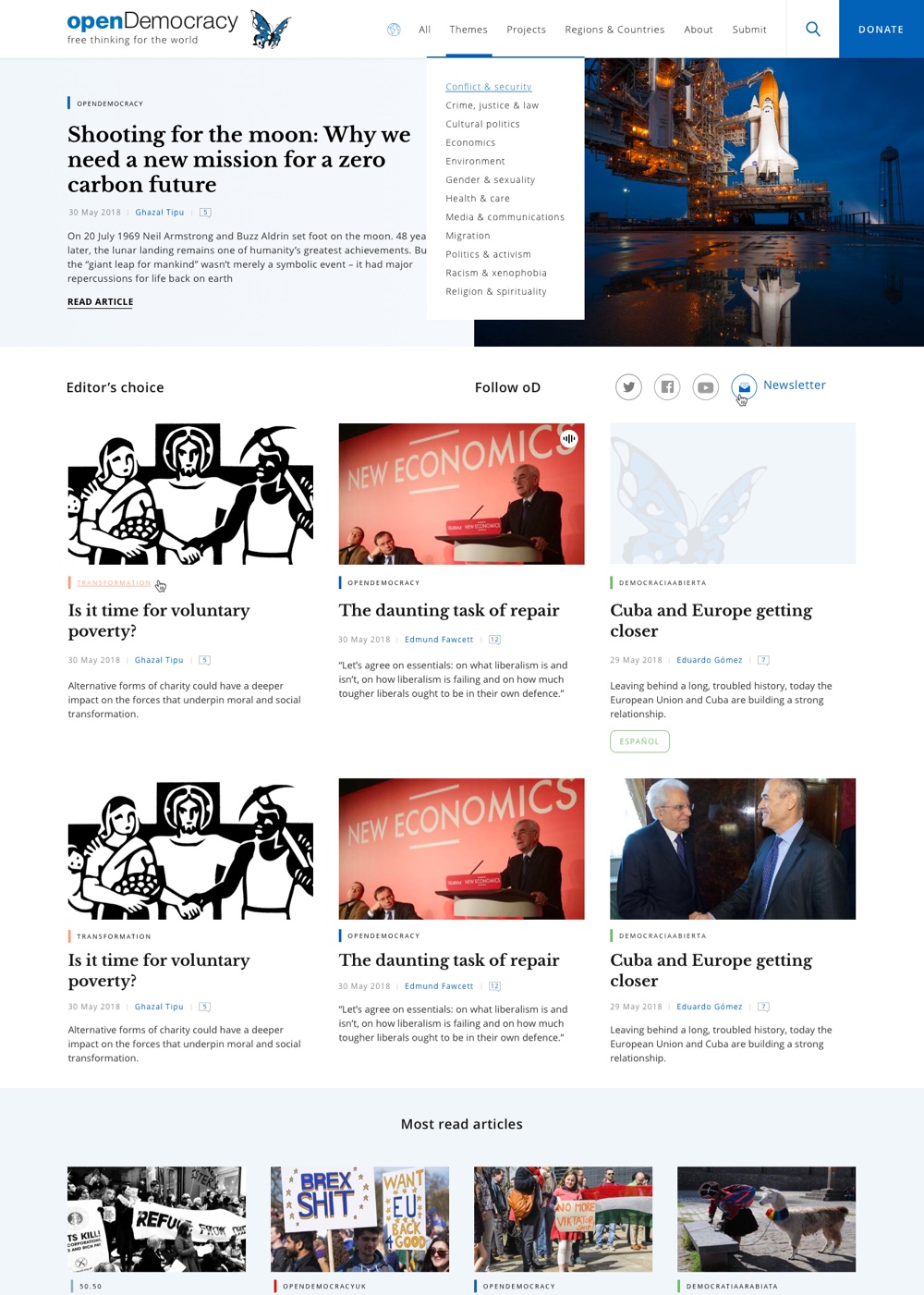
With 30 editors, each looking after their own section of the site we had to create innovative ways to surface relevant content across sections to help users find content they’re interested in, in the quickest way possible. Article lists don’t just show content from the page tree but also include related articles from elsewhere on the site and even articles from external sites. Every article has lateral navigation options when you reach the end which can be configured by editors to show articles by the same author, articles in the same section, or even articles that are thematically similar.
To ensure that nothing was lost in the new site, we needed to migrate nearly 50k articles from the old website. Some of these were as standard (rudimentary pages with copy and images), some were bespoke (campaign or regional), and some proved unusual discoveries of page types within page types. In each instance we found a way to migrate the content and historical use of images to pages that displayed the work in as engaging a way as possible.
With this complexity in the background we had to find ways to ensure the site was still performant on page loads. Like every site we create we used custom build pipelines that minify and compress static assets and employed a content delivery network to serve faster, but special requirements of the openDemocracy site meant that we had to tweak and customise the entire stack to get the best performance possible. For this we benchmarked six different application servers on speed and stability and implemented multiple smart caching systems. Through fine tuning these systems we brought page load times down below those of any of the major UK newspapers. A typical article page on openDemocracy reaches the time-to-interactive state three times faster than a typical article on The Guardian website, 3.5 times faster than Mail Online and over five times faster than an article on The Sun.
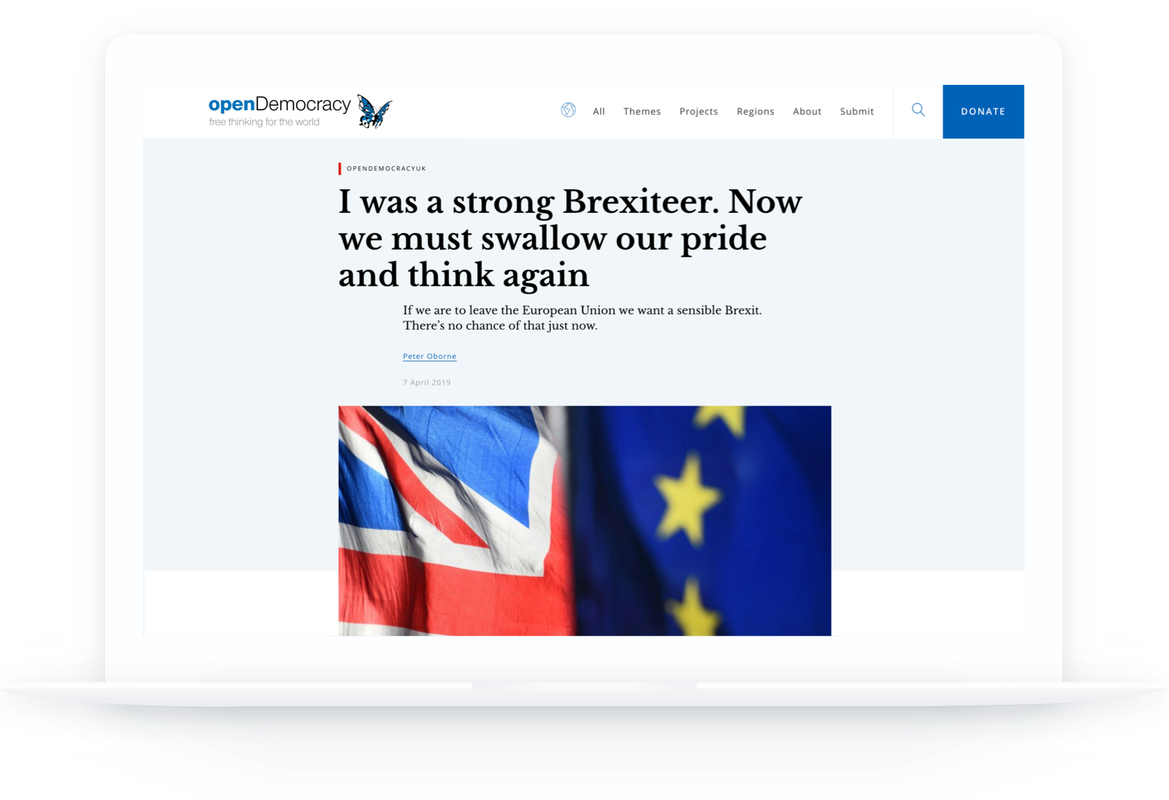
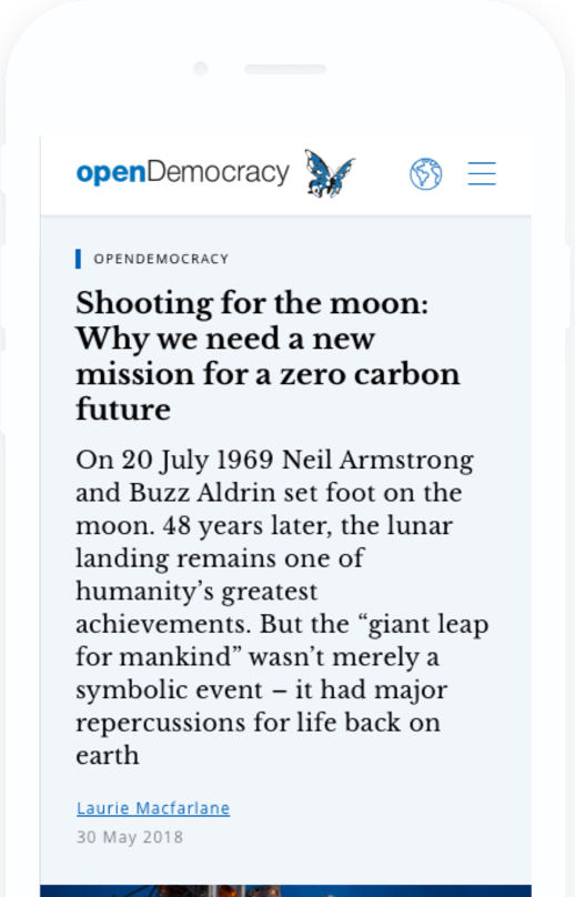
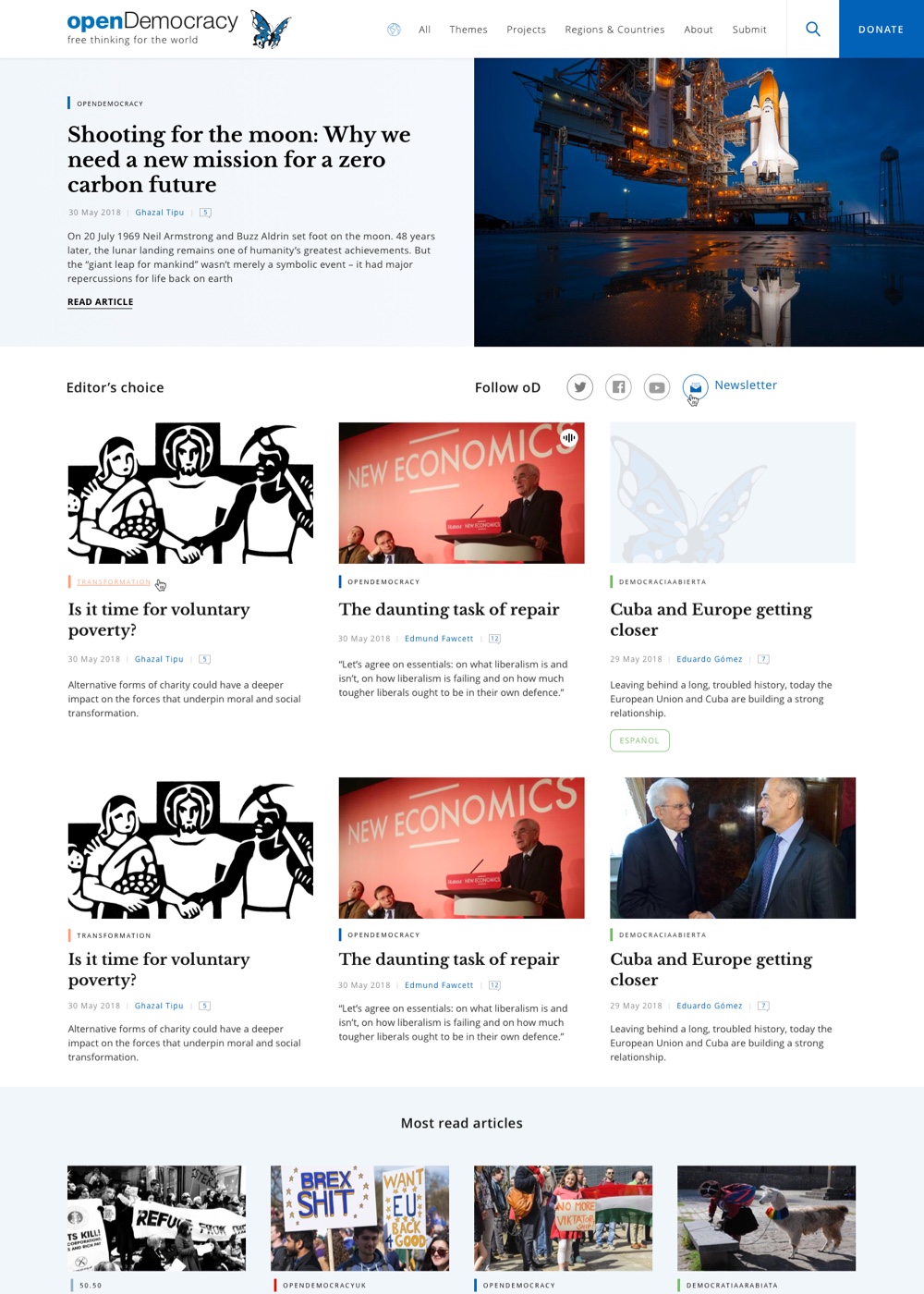
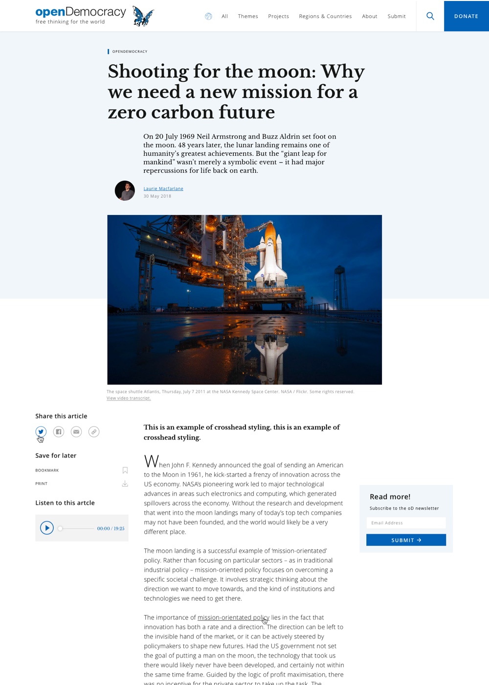
Our aim wasn’t to alienate existing users or distract new ones. We had to take a measured design approach to ensure original branding wasn’t lost while using it in a cleaner and clearer way. We were careful to use primary brand colours to highlight content throughout site and across projects so that we could always trigger brand recognition.
openDemocracy.net isn’t just a beautiful reading experience in English, it also displays in five languages, including Arabic - no mean feat when pages are usually designed left to right.
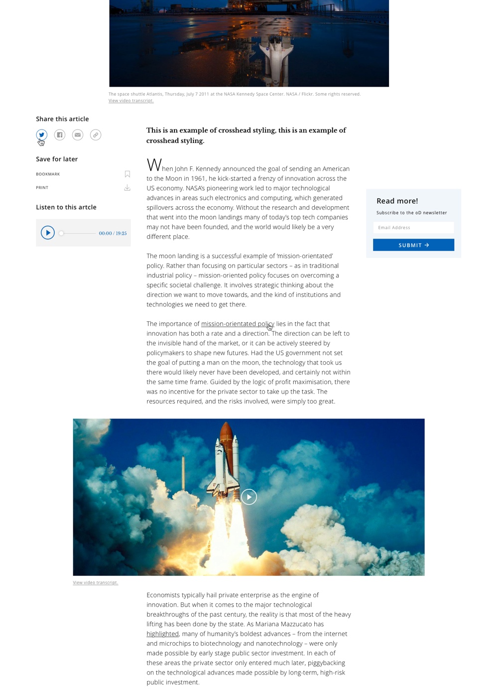
The platform is, given its size and content, a news site. As part of our work on defining successful adoption ladders it was essential that we create an enjoyable experience for both readers and writers, and an experience that encouraged readers - both old and new - to share quotes from within articles and push articles to friends and followers. And of course we made absolutely sure that the site was usable by pretty much anyone with a device that connected to the internet.
Within a month of the new site going live, openDemocracy received almost a million page views, 70% of which were from new users. Since launch Entrances, Page Views, and Unique Page Views all increased at least 20% compared to 2018.
What’s also remarkable is that now that the site is no longer painfully slow and unwieldy on mobile the number of users choosing to view the site on the move is up over 60%.
Given the real world pressures on the team at openDemocracy, they have been fairly reserved about making any great fanfare over the launch of the new site. As such we feel that its increased performance, increased audience engagement, and the lack of the usual “I can’t believe they’ve changed the layout!” comments on social media are testament to the quality of the work we’ve accomplished together.
The team at openDemocracy now have a powerful and scalable platform to help the organisation with their next phase of growth, during a time when independent journalism is at its most valuable and necessary.
